web analytics

Monday Inspiration

Posted on: January 14th, 2013 by Hannah Beasley 2 Comments

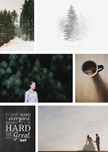
I miss winter. I miss the excitement that comes with a fresh fall of snow, the sharp cold in the air that wakes everyone up and brings out the color in their faces. It’s warm here, and raining, and as I sit at my desk looking out at the gray sky and dark trees I can’t help but wish that snow would come. But for now I’ll settle for winter in design, and I’ll pretend it’s twenty degrees outside. And maybe snow will come…

Happy Monday! =)

inspiration

{all images via pinterest. clockwise, from top left: 1 // 2 // 3 // 4 // 5 // 6}

Dreams

Posted on: January 12th, 2013 by Hannah Beasley 12 Comments

I want to live quietly. To go back to how it was before modern life came and swept away so much of what people used to know years ago. I want to go back to a time where women listened to the call inside them and made their houses beautiful and loved their families, where you would be criticized for going out into the world on your own but not for living quietly with your husband. I want to go back to a time when girls weren’t bombarded by people asking them what college they were going to or what career they would go into, when people worked with their hands and farms were not a wonder to see.

I don’t think it’s silly or wrong to have simple dreams. Because though society laughs at them, they are sometimes the most important things you could ever wish for. What is life, anyway? Is it the big goals and grand resolutions to change the world, or is it the very small things that no one ever sees? Death comes to us all. People live, die, and are forgotten. Even those of greatness are not always remembered, their deeds not always held in regard. The vapor of your life will fade away in an instant, and what will it have been worth? I don’t want to live for big things and remarkable deeds. They are deceitful things – promising happiness, but many times snatching it away instead. I want to take each second of my life and live it as I was intended to, with the people I love, knowing that they, too, will be  gone someday, and the chance for love will have passed. I want to live knowing I will die, and not being frightened of it. I want to serve Jesus the whole time, knowing that He is really all that matters, that He is the one I will go to when I do die.

My dreams in life aren’t to be a well-known designer or a famous photographer. I love design, I love photography, but they aren’t my life. I want to get married young and have a family. I want to learn how to grow my own food and have just enough to be comfortable and live as simply as I can. Society can laugh, but that is my dream.

What’s yours?

january 048

Dark Beauty

Posted on: January 10th, 2013 by Hannah Beasley 2 Comments

Dusky purple + distressed wood + gypsy is how I think I would describe this style. I think it is so beautiful and unique – kind of a dark bohemian look with some added sparkle and swirls. This is one of those projects where an idea just popped into my head, complete with all the details. I just love it when that happens, when something just feels right! It makes everything so much easier and a lot more fun. I can’t wait to start fleshing it all out, to show it to the sweet lady I’m working with + see what she things, and share it here, too.

{I’m upgrading to an iPhone and am selling my iPod…check out this link for more info if you’re interested in purchasing it from me!}

moodboard

Monday Inspiration

Posted on: January 7th, 2013 by Hannah Beasley 5 Comments

It’s so nice to get back to doing these. <3 Breaks are always lovely to have, but getting back into the normal swing of life is so good. I am so glad I started doing these posts – because I am very sure that the act of going through Pinterest, harvesting images I love, and compiling them for your enjoyment has helped me figure out what it is that I really love in terms of photography and design. I feel like my own tastes are developing so quickly, and it’s exciting to see that happening. I just want to keep growing and experimenting and learning – to become a truly creative person with all of the uniqueness God has given me. And what’s so wonderful about it all is that I can use it for the rest of my life – with my family, with my friends…I don’t have to be a professional to keep doing all of this. It’ll be with me for the rest of my life…and for that I’m thankful.

Here’s to life.

inspiration

{all images via pinterest. clockwise, from top left: 1 // 2 // 3 // 4 // 5 // 6 // 7 // 8 // 9 // 10 // 12 // 13 // 14 // 15 // 16}

How To Get the VSCO Look in Photoshop – Tutorial + Actions UPDATED

Posted on: January 3rd, 2013 by Hannah Beasley 44 Comments

*NOTE: This is in no way a replica of VSCO. I recommend purchasing VSCO for Lightroom or Camera Raw if you’re able, as they’ve done an amazing job of creating some impressive presets for your photos. This is simply my very affordable way of trying to achieve a similar look using what’s available to me. And I look forward to purchasing VSCO sometime in the near future.*

I felt the need to re-do this tutorial because in the last few months I’ve done quite a lot of experimentation with some of the methods I used. I’ve been growing and developing as a photographer – from using my camera to finding the right way to edit my photos. I’ve FINALLY found the right way to make this work, and I’m 100% satisfied and happy with it! Yay! So here’s the updated tutorial…enjoy!
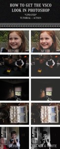
pinterest

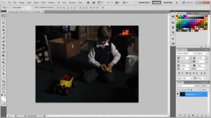
First off, keep in mind that you need to be shooting with an image in your head of what you want your final shot to look like. For this specific style, you’ll need to underexpose your shots. I don’t have a formula for you – but keep in mind that your subject’s skin is the most important thing to get “right” in terms of color and exposure. If you can capture the true color of the skin and make sure you’re not blowing any parts out, then your photo will look perfect when you edit it. (You’ll notice the photo I’m using is pretty substantially under-exposed. I only wanted to capture my little brother – and the highlighted part of his face.)

If you would prefer to use an action instead of doing this yourself, feel free to download my action set here. I’ve included the original action, the updated action, and a black and white action. You are free to use these as long as you do not re-distribute them or claim them as your own. (Photographers, feel free to use them on photos for clients)
1

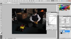
1. This is the photo we’ll be using.

2

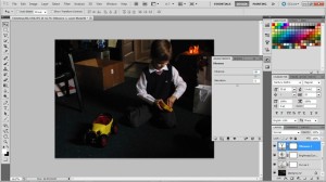
2. First off is lightening the shot just a little bit. I find that I normally need to do this. Click the circular button directly below the center of the layers panel and click curves. Bring the line up until you have a slight curve.
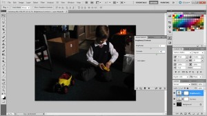
3

3. My camera does not capture the range of colors or the contrast I wish it would – so here I’ve added a brightness/contrast layer to compensate for some of that. I’ve set the contrast to 40.
4

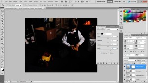
4. Next is to add some more color. If you have a dslr (I shoot with a Canon Powershot SX20IS – a high-end point and shoot. I know, I know, sounds like an oxymoron, doesn’t it? ;) ) you may not need to do this, as your camera doubtless captures many more and much better colors than mine. I’ve set the Vibrance layer to 80.
5

5. One of the most important parts is to edit individual colors. Here are the settings I’ve used in the Selective Colors panel-

Yellow: Magenta +70, Yellow +20
Green: Yellow +50, Black +100
Blue: Black +30
Black: +25
6

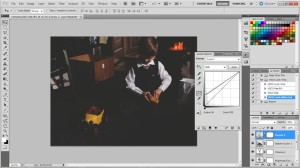
6. Lastly is adding the matte layer that gives your photo that film look. To do this, add a new curves layer and individually adjust the red, green, and blue channels so that each one of them looks like the ones above. (Note that the screenshot is of all R, G, and B channels together) They all need to be as exactly the same as possible. Once you’ve done that, decrease the opacity of the layer to 50%.

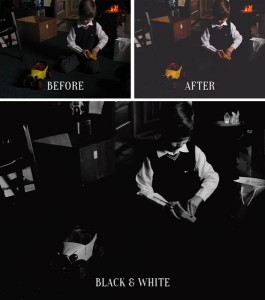
And that’s it! The most important parts of all of this would be the contrast layer, the selective coloring (especially the blacks), and the final curves layer. If you’d like to make a black and white version, just use this same method to edit your photo, save it as a jpeg (or just merge the layers) open it back up, change the mode to grayscale, change the mode again to duotone, and choose Bl for low con CG9 CG2. I love this preset so much – it gives you a just-about-perfect black and white edit without hardly any work!

I hope this tutorial has been helpful! Feel free to ask any questions you might have.
beforeafter