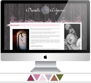
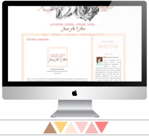
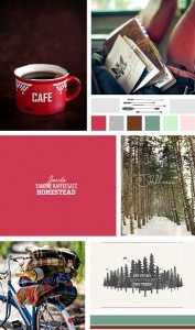
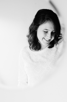
Remember that mood board I posted a while ago that I said I loved for its unique style? Well, this is the finished design! And let me tell you, it was fun to work on. The idea for the design just popped into my head not long after we started talking about all of this, and it was one of those projects where I just knew what I should do. It normally doesn’t happen like that – normally I will work out my many different ideas on paper and think a lot about my options before deciding. But this time it just happened. And I loved it. Rachel was so sweet and so much fun to work with! She told me more than once how excited she was about the design, and her enthusiasm definitely fueled mine. =D I thoroughly enjoyed working with her, and am so glad we were able to come up with a design that she loves so much. Head on over, check out her blog, and leave her some love!
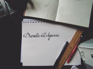
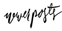
One thing I did on this project that I haven’t done much of is hand lettering. I’ve always been interested in calligraphy and the art of writing (you should see my fountain pen collection.), but I have to say I’m not that great at working with calligraphy nibs and dip pens. So hand lettering is perfect for me – because it’s slow, careful drawing that creates the flourishes and decorations, instead of fast + necessarily steady strokes. And I love how unique it is. Because no matter how perfect you can draw out what you’re working on, it will still have that personality that comes from doing things by hand. And I think that is very special.
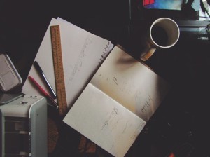
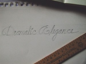
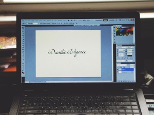
For the title, Dramatic Elegance, I drew inspiration from two different typefaces, Bispo and Champignon. Both fonts are really beautiful, and I wanted to include elements from both, while still creating something that was my own. I worked out what the title would look like in my sketchbook (I can’t say how important it is to visualize what you’re going to do before you actually start doing it), and then drew it out in pencil and then ink. After cleaning it up in Photoshop it was ready for the blog!
