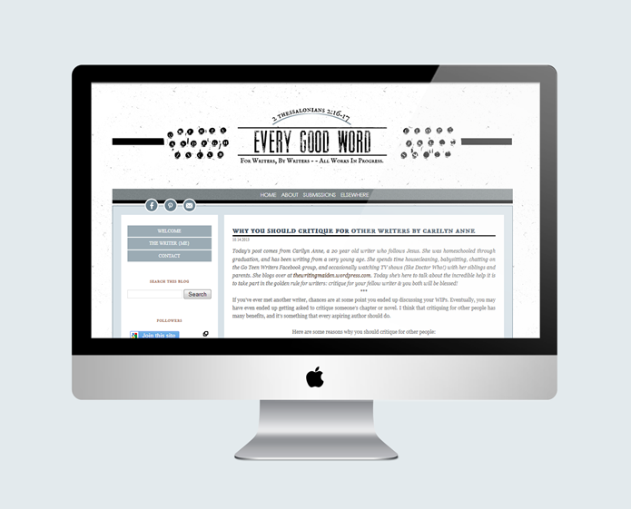
Meghan and I finished up her blog design quite a while ago, but it’s taken me this long to finally post about it! Hey, better late than never, right? We had so much fun working on this, from the very beginning to the end. The mood board for this project is one of my very favorites – she wanted to go with a writerly/retro/professional feel, using black and different shades of blue as the main colors. She wanted to incorporate a typewriter somehow, and I think figuring out how to do that was the hardest part. I tried quite a few different things – putting a drawing of a typewriter in the header, putting a small one in the sidebar, and more things that I can’t even remember – but it just didn’t work with the title design. So I finally tried just using the keys…and somehow it just fit. You know that feeling when you’ve tried everything and then there’s that one solution that just works? Yeah, it’s pretty nice. Thankfully Meghan loved it! =) I always enjoy working with her – she’s one of the sweetest people you’ll ever meet. Go check out the blog – it’s an awesome community of writers who share tips and thoughts on writing.
Monday Inspiration
It’s finally fall here, although I’m not sure the trees know that. They’re still very green and seem to be dragging their feet when it comes to changing color. Fall is my favorite season. Something about the snap in the wind makes me feel more alive somehow. I always find myself wanting to spend all my time outside right about now…I would love to explore places I’ve never been with one or two people and my camera. Maybe someday.
{all images via pinterest. clockwise, from top left: 1 : 2 : 3 : 4 : 5}
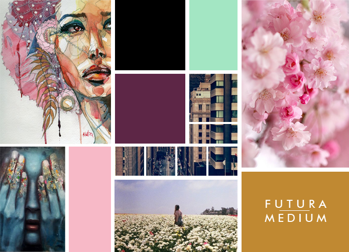
Client Mood Board
I love the colors and style we’re using for this project. While we’re using pinks and purples as the main colors, there’s an edge to the whole thing that keeps it from being girly. I think the combination of soft pinks with hard blacks – just like the combination of the flowers with the shot of the city – is really neat. I’m enjoying going in a direction with this project that I haven’t gone before! So far we’ve finished the logo and are on to the site…and we’re going to do some pretty unique, full-of-personality things with it. I’m looking forward to sharing the finished product soon!
Monday Inspiration
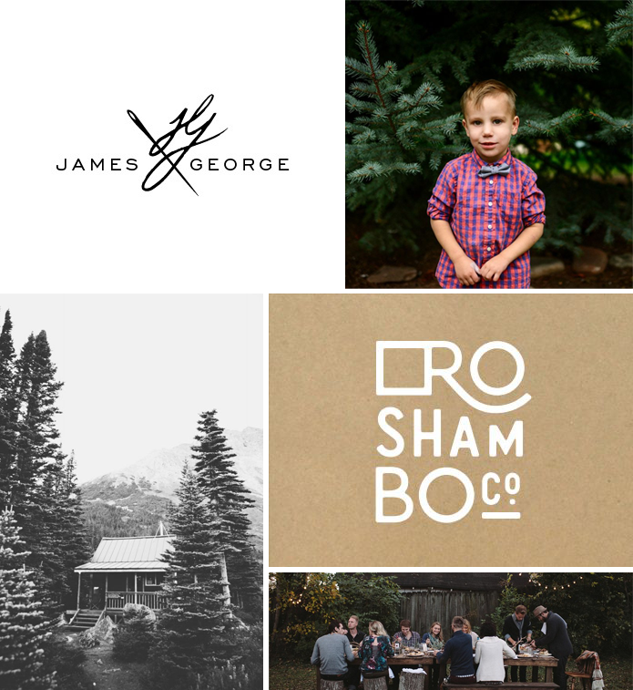
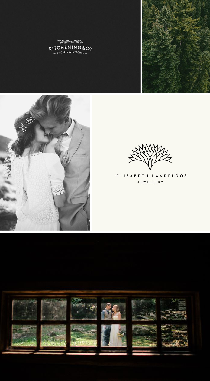
Black backgrounds, white type, evergreens, simple photos and simple design. I love it. Sometimes I feel like a broken record, always posting graphic design and photos like the ones here, but hey, it just doesn’t get old! My favorite from these Pinterest images is the top left one…I am fully convinced that the logos that are not complex or busy are the ones that make the biggest impact. When I started out as a graphic designer I thought the power of a visual identity lay in choosing the right kind of illustration (the more detailed the better). I used some pretty intense typefaces and had the philosophy that “more is better.” But I don’t believe that anymore. There is power in simplicity.
{all images via pinterest. clockwise, from top left: 1 : 2 : 3 : 4 : 5}
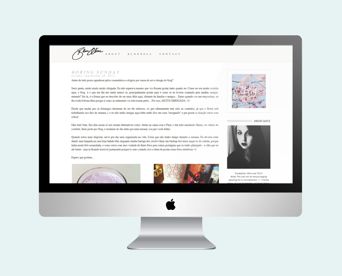
Bleu Alice : Blog Design
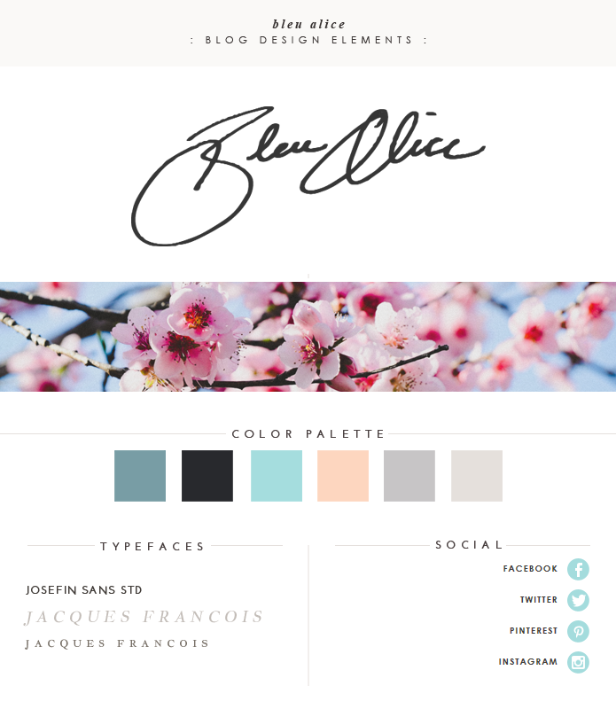
This design is probably one of my very favorites so far – I love its simplicity, with the little elements here and there that make it what it is. I think my favorite part is the handwritten “Bleu Alice” at the top…I love incorporating hand lettering into designs. Alice was so easy and fun to work with, and since we have very similar taste when it comes to design it was even easier to achieve what she was looking for.
Visit her site here!
I don’t normally include what could be termed a “brand board,” but because there were some elements in this design that I especially love, I wanted to share them!
