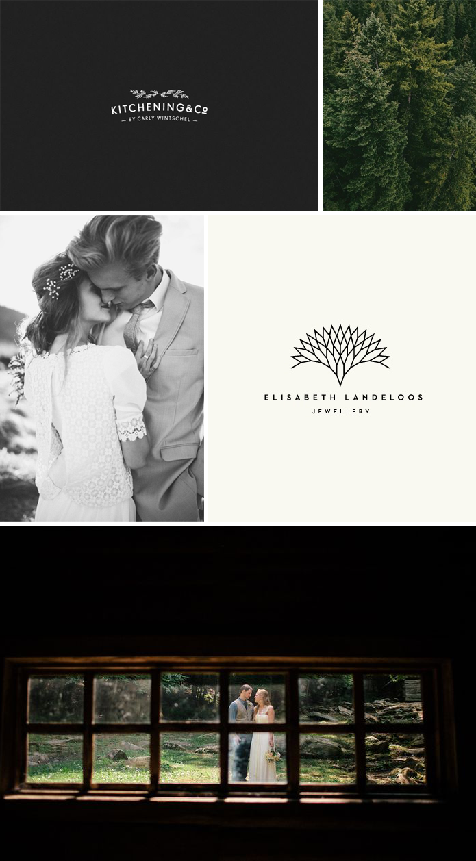
Black backgrounds, white type, evergreens, simple photos and simple design. I love it. Sometimes I feel like a broken record, always posting graphic design and photos like the ones here, but hey, it just doesn’t get old! My favorite from these Pinterest images is the top left one…I am fully convinced that the logos that are not complex or busy are the ones that make the biggest impact. When I started out as a graphic designer I thought the power of a visual identity lay in choosing the right kind of illustration (the more detailed the better). I used some pretty intense typefaces and had the philosophy that “more is better.” But I don’t believe that anymore. There is power in simplicity.
{all images via pinterest. clockwise, from top left: 1 : 2 : 3 : 4 : 5}


