I wanted to write this post and go through all the little details because – let’s face it – branding is a huge task, however fun it may be! Hopefully the mistakes I’ve made and the lessons I’ve learned will be a help to any of you who are working on re-branding or working on getting the right idea about your business. (I apologize in advance for the extreme length of this post!)
WHAT A BRAND IS. First off, your brand is not just your logo. Your brand is you, how you connect with others, your values and dreams and goals. Before you even think about having a visual identity developed for your business, you must be at the place where you know who you are as a small business owner. You need to have enough experience in your job to be confidant about where you’re going. The designing part of branding is the very last step in the process – the process that starts with you really figuring out what your business is, where it’s going, and who you are in all of that.
Secondly, your visual identity needs to represent YOU. Back last June I decided I was too much into blacks, browns, and neutrals. I thought it wasn’t a good idea to always go back to the same styles and colors. But guess what? The blues and yellows I ended up going with were just not ME. Sure, I liked the design, but it wasn’t Hannah Beasley. It took me a while to realize that I needed to stick with what I really loved, even if it felt like it was the same old thing.
THINKING ABOUT MY BUSINESS. So the first thing I did was sit down and think about how I work with clients, where my business is, where I want it to go, and how I’m going to get there. I worked out in my mind what I needed to change about the way I operate in order to get to the next step. Part of that included the following – creating a client welcome packet, including a simple contract, basic info, and a fully developed questionnaire; changing some processes in order to give more time and energy to my clients; and challenging myself to teach myself about print design + Illustrator. (Yes, I’ve previously been using Photoshop as my exclusive design program.)
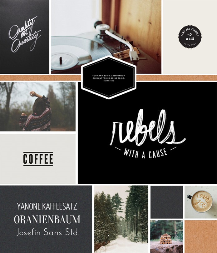
DISCOVERING MY STYLE. Once I had a game plan for my business I was ready to think about the visual side. So I went on pinterest and looked at all my pins – not just the ones I had in my brand board. The reason I did this was to get a really strong idea of what I was constantly being drawn to in terms of design, color, style, and mood. I realized everything I pinned was moody, striking, had a lot of blacks, grays, and browns, and much of the design I had was type on photos. Rustic logos, natural textures, and geometric structures were what I was constantly loving.
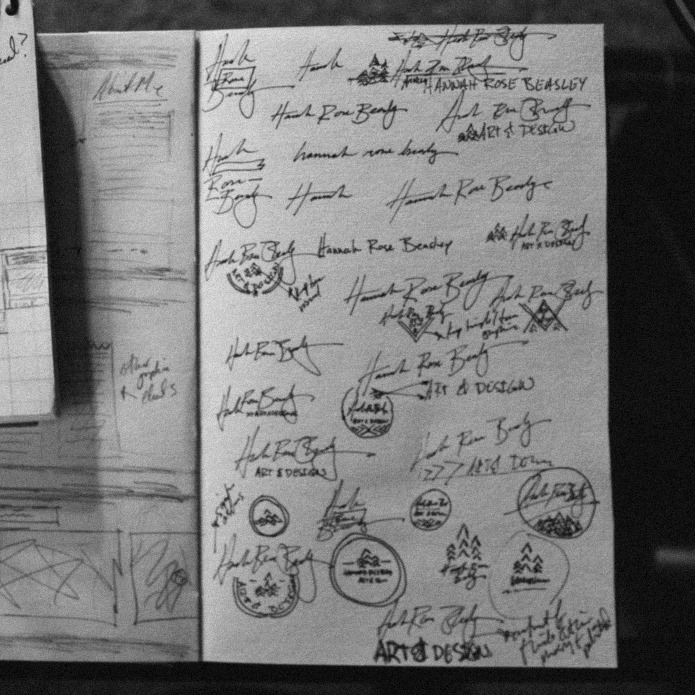
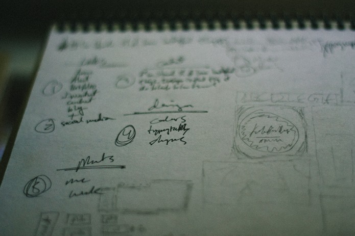
DEVELOPING MY LOGO. So I started coming up with ideas for my logo. I love evergreens so, so much, and I decided to play around with using some artwork I had created as a part of my visual identity. I did a lot of drawing and sketching out of ideas to just throw everything that was in my head onto paper and see if any of it went anywhere. I’m going to show you some of my ideas that I eventually chucked to demonstrate how much of a process this is! >>
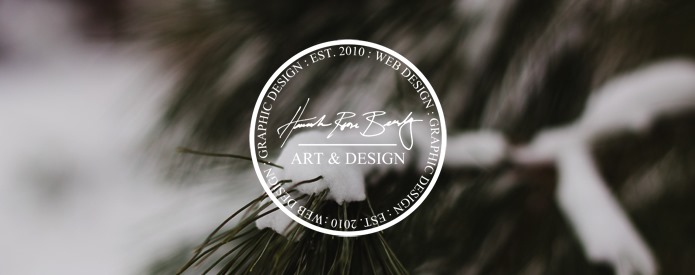
I liked some of what I came up with, but it didn’t feel simple enough. I wanted to incorporate my handwriting in some way because I believe handwriting is such a good window into someone’s personality – and I love the look of lettering paired with type! So after taking my time and really experimenting with quite a few things, I came up with the final logo. >>
Simple, bold, with just a little bit of a rustic/handmade look to it. That was it. I loved it and knew it would be something I’ll end up using for a long time…and that’s another key, to make your visual branding something LASTING. A solid brand isn’t so solid if it keeps changing!
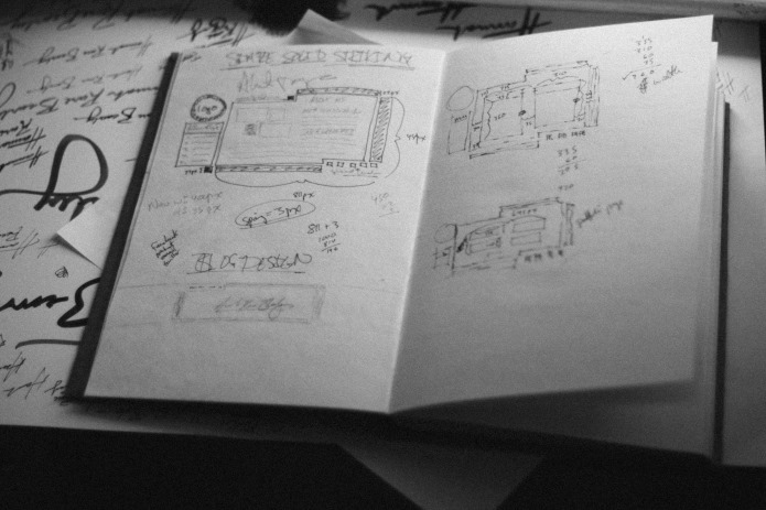
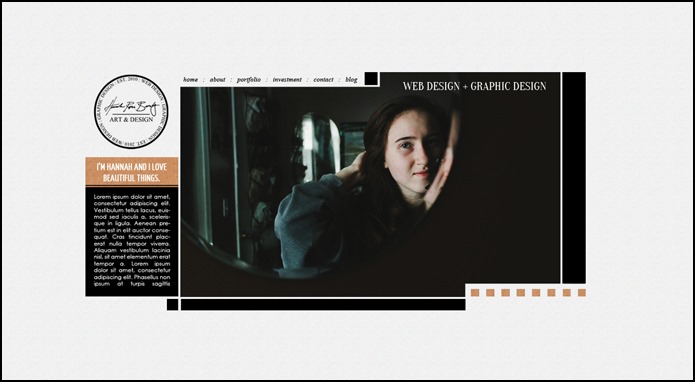
DEVELOPING THE WEBSITE. Once I had my logo it was time to move on to a site. I wanted something very geometric and striking, something completely unique and very different. I tried quite a few different layouts and designs – there’s so much in web design that I love, that I had a very hard time settling on what to do! But finally I just opened up Photoshop and started playing around with ideas. Previously I had been coding everything – so I had a couple semi-finished sites. (I do not recommend starting with code – it’s better to get an idea of everything by drawing your design first, refining in Photoshop, and then coding.)
^^the photoshop version of the site^^
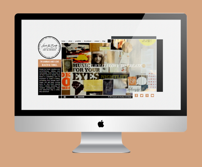
^^the final website^^
And that was it! After developing the site in Photoshop I started on the coding side of it (I can’t tell you how helpful it is to be a graphic designer AND developer – it makes coming up with ideas much easier, knowing how everything will work with the html + css). The single biggest part of this project was the video + putting it into the site. My brother is a very talented editor, and he shot and edited the whole video. I wanted to do something very simple – no voiceovers or long introduction, just something quick and simple that would give visitors an idea of who I am as well as what I do. It literally took two whole days – eight hours each – to get the video positioned correctly and functioning in all browsers, as well as to add jquery controls and enable the site to work correctly on iPads and iPhones. But I’m so happy that I kept trying, because I really love the final product and am so happy with the work my brother did.
SOME TIPS. 1. Don’t rush it. If you don’t feel 100% confidant in your business and your process, just wait for a while. Keep your logo and website as simple as you can and let yourself grow in your skills.
2. It’s commonly stated, but is so true! If you’re having trouble deciding on your colors, just look through your closet and let those colors determine what you’ll use. If you looked through my drawers, you’d see a ton of black, some gray, and couple neutral colors.
3. Let yourself take a lot of time to develop every single aspect of your visual brand. It’s very easy to get excited about your project and launch it prematurely, whereas taking an extra few weeks to refine it would make it twice as amazing.
4. Have fun. If working on your logo + site isn’t something you’re enjoying, take some time to sit back and get away from it. The best times to work on your branding are when you’re excited and full of ideas, not when you have to force yourself to work on everything.
I hope all of that was a help to some of you! Once again I apologize for the length of this post…I don’t think I’ve ever posted anything this long. But there are definitely a lot of things I’ve learned during this process, and it’s fun to share that with you all!



ahh… that was awesome. and extremely helpful.
i am hoping to create a brand for a project of mine that I’m working on, and this was totally awesome. and your hand-scripted logo is absolutely rad.
Oh, I’m so glad! =) Hey, have fun on that project! I’m sure it’ll be great. =) (Thanks for the compliment. I’m glad you like my logo! =))
hai hannah,
i love your design
and your advice about whats a brand is
im going to make a new project logo and i was so stunning with all of the logo that i saw in the internet. with all of the collors that looks so sweet.
but i was realize that its not me, its not my style , its not like what i used to be .
well thankyou for inspiring me , your work is great!