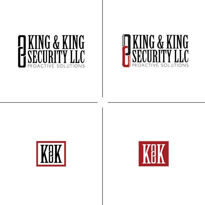
I totally enjoyed working on this project for King & King Security – the goal was create a solid visual identity for the company that would convey a sense of strength and protection. The colors chosen were deep red and black…one of my favorite combinations! We ended up going with this simple but bold version – incorporating a modern take on two linking chains. I added a little bit of traditionalism in the form of a gradient to the final color logo, but the graphic itself still preserves a modern flair. I think my favorite from this whole project is the lower-left mini logo. =) I love that it’s very simple but still striking!
[vivafbcomment]


My name is Hannah. I'm a graphic designer and web developer; I love Jesus, coffee, and music; and snow is my favorite. Welcome to my blog! Stay a while, why dontcha?
Categories
On Pinterest
Search
Archives
- January 2016
- December 2014
- November 2014
- September 2014
- August 2014
- July 2014
- June 2014
- May 2014
- April 2014
- March 2014
- February 2014
- January 2014
- December 2013
- November 2013
- October 2013
- September 2013
- August 2013
- July 2013
- June 2013
- May 2013
- April 2013
- March 2013
- February 2013
- January 2013
- December 2012
- November 2012
- October 2012
- September 2012
- August 2012
- July 2012
- June 2012
- May 2012
- April 2012
- March 2012
- February 2012
- January 2012
- December 2011
- November 2011
- October 2011
Site designed & coded by Hannah Rose Beasley Art & Design.
© 2025 Hannah Rose Beasley | Blog.
© 2025 Hannah Rose Beasley | Blog.


these are brilliant, hannah! you never cease to amaze me. xx | Natalia
Aww, thanks Natalia!