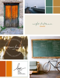
The idea for this project is the concept of how amazingly powerful nature is compared to the things that men build. You so often see old, falling down buildings in vast fields or waves beating against a forgotten pier. It’s a really interesting concept, I think, and I love the colors we’re working with – especially the dusty blue and the burnt gold. The colors + handwritten type makes for an extra-fun project!
(Thank you all for your sweet comments on my last post! Jo loved it when I told him what you all said, and in addition to that I’ve been doing much better in the last few days. I’ve just needed to stop worrying…not always an easy thing to do! Thank you guys for everything you said – each comment I get always means so much to me!)


What a lovely palette! I love every one of the colors!
i love this! the colors are perfect, as well as the font.
This is lovely! The green & orange go so well together. <3
ooooh, love this. :) beautiful color scheme–they go together so perfectly! :)
x, m
http://www.maid4him.blogspot.com
The colors are gorgeous, but I am absolutely in LOVE with the fonts!
I think this might be one of my favorite inspiration boards. The colors are amazing together!
ah yes, perfection. the colours, fonts, and pics are gorgeous!
Thanks guys! I’m glad you all like it! =D Yeah, it’s fun to be working with colors like these…recently I’ve been doing more with pastels. Thanks for the comments!